Have you ever stared at a stunning design and wondered, "How did they make those colours work so perfectly together?" 🎨 If you're a designer,…
The Ultimate Guide to Mastering Colour Theory in Design
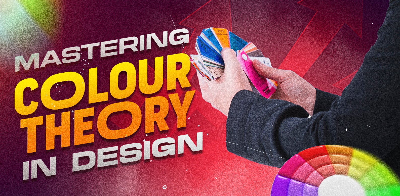
Have you ever stared at a stunning design and wondered, “How did they make those colours work so perfectly together?” 🎨 If you’re a designer, marketer, or anyone interested in visual communication, mastering colour theory is your secret weapon to creating captivating and effective designs.
But here’s the problem: colour theory can seem overwhelming and complex, especially when you’re just starting out. With countless colour combinations and nuanced psychological effects, it’s easy to feel lost in a sea of hues and shades. Don’t worry, though – we’ve got you covered! This ultimate guide will demystify colour theory and equip you with the knowledge and tools to confidently wield color in your designs.
From understanding the basics of colour wheels to exploring advanced techniques like colour psychology and digital application, we’ll take you on a journey through the vibrant world of color theory. Get ready to unlock the power of colour and elevate your design game to new heights! 🚀
Understanding Color Basics
A. Defining color theory
Color theory is the foundational framework that guides designers in understanding and utilizing colours effectively. It encompasses the principles and guidelines for creating harmonious color combinations and communicating visual messages through colour. By mastering colour theory, designers can evoke specific emotions, create visual hierarchy, and enhance the overall aesthetic appeal of their work.
B. The colour wheel explained
The colour wheel is a visual representation of colour relationships, serving as a crucial tool for designers. It organizes colours in a circular format, making it easier to understand their interactions and create balanced colour schemes.
| Colour Wheel Type | Description |
|---|---|
| Traditional | 12 colours based on RYB (Red, Yellow, Blue) |
| Modern | Based on RGB (Red, Green, Blue) or CMYK (Cyan, Magenta, Yellow, Black) |
C. Primary, secondary, and tertiary colours
- Primary colours: Red, Yellow, and Blue (in traditional colour theory)
- Secondary colours: Green, Orange, and Purple (mixed from primary colours)
- Tertiary colours: Yellow-green, Blue-green, Blue-purple, Red-purple, Red-orange, and Yellow-orange (mixed from adjacent primary and secondary colours)
D. Hue, saturation, and value
These three attributes define the characteristics of a colour:
- Hue: The pure colour itself (e.g., red, blue, yellow)
- Saturation: The intensity or purity of a colour
- Value: The lightness or darkness of a colour
Understanding these basic concepts of colour theory lays the groundwork for more advanced colour applications in design. With this knowledge, designers can confidently move on to exploring colour harmonies and their effective use in various design contexts.
Colour Harmonies for Effective Design
A. Complementary colour schemes
Complementary colour schemes are powerful tools in design, creating vibrant and eye-catching contrasts. These schemes use colors opposite each other on the color wheel, such as blue and orange or red and green. When used effectively, they can create a bold and energetic visual impact.
| Complementary Pair | Primary Color | Secondary Color |
|---|---|---|
| Blue-Orange | Blue | Orange |
| Red-Green | Red | Green |
| Yellow-Purple | Yellow | Purple |
To use complementary colours effectively:
- Balance the intensity: Use one colour as the dominant hue and the other as an accent.
- Consider tints and shades: Experiment with lighter and darker versions of the colours.
- Use neutrals: Incorporate neutral colours to prevent overwhelming contrasts.
B. Analogous color combinations
Analogous colour schemes use colours that are adjacent to each other on the colour wheel. These harmonious combinations create a cohesive and pleasing visual effect. For example, a blue, blue-green, and green colour scheme would be considered analogous.
Key points for using analogous colours:
- Choose one dominant colour
- Use the second color to support
- The third colour can be used as an accent
C. Triadic and tetradic harmonies
Triadic colour schemes use three colours equally spaced on the colour wheel, while tetradic schemes use four colours in two complementary pairs. These schemes offer more complexity and variety in design.
Now that we’ve explored these harmonies, let’s move on to monochromatic designs, which offer a different approach to colour usage in design.|
The Psychology of Color
A. Emotional responses to different colors
Colours have a profound impact on our emotions and can evoke specific feelings:
| Colour | Emotional Response |
|---|---|
| Red | Excitement, passion, urgency |
| Blue | Calmness, trust, stability |
| Yellow | Happiness, optimism, energy |
| Green | Growth, nature, harmony |
| Purple | Luxury, creativity, mystery |
| Orange | Enthusiasm, adventure, confidence |
Understanding these associations helps designers create impactful visual experiences.
B. Cultural color associations
Colour perceptions vary across cultures:
- White: Purity in Western cultures, mourning in some Eastern cultures
- Red: Good luck in China, danger in Western countries
- Purple: Royalty in Western cultures, mourning in Thailand
Designers must consider cultural context when choosing colours for global audiences.
C. Using colour to influence user behaviour
Strategic colour use can guide user actions:
- Call-to-action buttons in contrasting colours
- Warm colours to create urgency in sales
- Cool colours for relaxing, informative content
- Green for environmental or financial themes
D. Colour symbolism in branding
Brands leverage colour psychology to convey their identity:
- Blue: Facebook, LinkedIn (trust, professionalism)
- Red: Coca-Cola, Netflix (excitement, passion)
- Green: Whole Foods, Starbucks (health, growth)
Choosing the right colour palette is crucial for brand recognition and message alignment. With this understanding of color psychology, we can now explore how to apply these principles in digital design.
Applying Color Theory in Digital Design
A. Choosing effective color palettes
When it comes to digital design, selecting the right colour palette is crucial. Start by considering your brand identity and target audience. Use color wheel tools to explore complementary, analogous, or triadic color schemes. Aim for a balanced palette with 3-5 colours:
- Primary colour: Your main brand colour
- Secondary colour: Complements the primary colour
- Accent colour: Adds visual interest and highlights important elements
| Colour Type | Purpose | Example |
|---|---|---|
| Primary | Brand identity | #3498db (Blue) |
| Secondary | Complement primary | #e74c3c (Red) |
| Accent | Highlights | #f1c40f (Yellow) |
B. Colour contrast for readability and accessibility
Ensuring proper colour contrast is essential for both readability and accessibility. Follow these guidelines:
- Maintain a contrast ratio of at least 4.5:1 for normal text
- Use a contrast ratio of 3:1 for large text (18pt or 14pt bold)
- Avoid using color alone to convey information
- Test your designs with color blindness simulators
C. Using colour to create a visual hierarchy
Colour plays a vital role in guiding users through your design. Create a clear visual hierarchy by:
- Using brighter or more saturated colours for important elements
- Applying muted colours for secondary information
- Utilizing colour to group related elements
- Implementing consistent colour coding for navigation and actions
D. Color in user interface design
In UI design, colour serves both aesthetic and functional purposes:
- Use color to indicate interactive elements
- Apply color consistently across different UI components
- Implement colour feedback for user actions (e.g., hover states, error messages)
- Consider cultural colour associations when designing for global audiences
Remember to test your colour choices across various devices and lighting conditions to ensure optimal user experience.
Advanced Color Techniques
A. Creating color gradients
Colour gradients add depth and visual interest to designs. They can create a sense of movement, dimension, and atmosphere. Here are some techniques for creating effective gradients:
- Linear gradients: Transition colours in a straight line
- Radial gradients: Transition colours from a central point outwards
- Angular gradients: Transition colours in a circular pattern
| Gradient Type | Best Use Case | Example |
|---|---|---|
| Linear | Backgrounds, buttons | Horizontal sky gradient |
| Radial | Spotlights, focal points | Sun-like effect |
| Angular | Circular elements, logos | Colour wheel representation |
B. Working with color overlays
Colour overlays can transform images and create cohesive designs. Tips for using overlays:
- Adjust opacity to control the intensity of the overlay
- Experiment with blending modes for unique effects
- Use overlays to unify disparate elements in a design
C. Colour in typography
Typography and colour work hand-in-hand to convey meaning and hierarchy. Consider:
- Contrast between text and background for readability
- Using colour to highlight important words or phrases
- Creating a colour palette for different text elements (headings, body, links)
D. Using colour for emphasis and focus
Strategic use of colour can guide the viewer’s attention:
- Use bold, contrasting colours for call-to-action buttons
- Implement colour accents to highlight key information
- Create visual hierarchy through colour intensity and saturation
By mastering these advanced colour techniques, designers can create more sophisticated and impactful visual experiences. Next, we’ll explore essential tools and resources that can help you further develop your colour mastery skills.
Tools and Resources for Color Mastery
A. Color picker tools and software
When it comes to mastering colour theory in design, having the right tools at your disposal is crucial. Colour picker tools and software are essential for selecting, analyzing, and manipulating colors with precision. Here are some popular options:
- Adobe Color CC
- Coolors
- ColorZilla
- Paletton
- Colordot
| Tool | Platform | Key Features |
|---|---|---|
| Adobe Color CC | Web, Mobile | Color wheel, Accessibility tools, Integration with Adobe apps |
| Coolors | Web, Mobile | Random palette generator, Color blindness simulator |
| ColorZilla | Browser extension | Eyedropper tool, Palette viewer, Gradient generator |
| Paletton | Web | Advanced color scheme designer, Color blindness simulator |
| Colordot | Web, Mobile | Intuitive touch-based interface, Color harmony suggestions |
B. Color palette generators
Colour palette generators are invaluable for creating harmonious color combinations quickly and efficiently. These tools can help you explore different color schemes and find inspiration for your designs:
- Adobe Color CC
- Coolors
- Canva Color Palette Generator
- Colormind
- Khroma
C. Colour theory books and courses
To deepen your understanding of colour theory, consider these resources:
- Books:
- “Color Theory: An Essential Guide to Color” by Patti Mollica
- “The Designer’s Dictionary of Color” by Sean Adams
- “Color Workbook” by Becky Koenig
- Online courses:
- “Color Theory Fundamentals” on Skillshare
- “Color for Designers” on LinkedIn Learning
- “The Practical Guide to Color Theory for Digital Artists” on Udemy
D. Inspiration sources for colour schemes
Finding inspiration is key to creating unique and effective colour schemes. Explore these sources:
- Nature: Observe colour combinations in landscapes, flowers, and animals
- Art museums and galleries: Study colour usage in paintings and sculptures
- Design websites: Behance, Dribbble, and Awwwards
- Pinterest: Create boards dedicated to colour inspiration
- Colour trend forecasts: Pantone Color of the Year and seasonal colour reports
By utilizing these tools, resources, and inspiration sources, you’ll be well-equipped to master colour theory and apply it effectively in your design projects.
Colour theory is a fundamental aspect of design that can elevate your work from good to exceptional. By mastering the basics of color, understanding harmonies, and delving into color psychology, you can create designs that not only look visually appealing but also evoke the desired emotions and responses from your audience. Applying these principles in digital design and exploring advanced techniques will further refine your skills and set your work apart.
As you continue your journey in colour theory, remember that practice and experimentation are key. Utilize the tools and resources mentioned to expand your knowledge and hone your craft. Whether you’re a beginner or an experienced designer, there’s always room to grow and innovate in the vibrant world of color. Embrace the power of color in your designs, and watch as your creations come to life with newfound depth and impact.
Recent Posts
- All Post
- Digital Marketing
- Graphics Design
- Storytelling


Reach Out!
If you’re looking for a holistic agency to work on your big dream, say the magic words!
Categories
Frequently Asked Questions
How does storytelling impact digital ad success?
Storytelling creates an emotional connection with your audience, making your brand memorable. We use it to humanize your brand, evoke emotions, and encourage engagement, which ultimately leads to higher conversion rates.
Why is data crucial for effective marketing?
Data-driven marketing uses analytics to understand customer behavior and optimize campaigns. It helps us predict trends, target the right audience, and allocate budgets more effectively, ensuring maximum ROI for every dollar spent.
Difference between paid, owned, and earned media?
- Paid Media: Advertising like PPC, social ads, and display ads that you pay for.
- Owned Media: Channels you control, such as your website, blog, or email list.
- Earned Media: Publicity gained organically through word-of-mouth, reviews, or media coverage.
We create strategies that integrate all three for comprehensive brand visibility.
Why is A/B testing vital for campaign optimization?
A/B testing allows us to compare two variations of an ad, email, or webpage to see which performs better. It helps eliminate guesswork, ensures data-backed decisions, and improves campaign efficiency over time.
What is programmatic ads, and how does it work?
Programmatic advertising automates the buying and placement of ads using AI and machine learning. It ensures your ads reach the right audience at the right time, often at a lower cost compared to traditional methods.
How does SEO drive growth for local businesses?
Local SEO ensures your business appears in location-specific searches, like “best coffee shop near me.” This drives foot traffic, improves online visibility, and enhances customer trust in your brand.
What makes retargeting so effective?
Retargeting shows ads to people who have interacted with your website or app but didn’t convert. It reminds them of your offerings, keeping your brand top of mind and increasing the likelihood of conversions.
How do you ensure privacy compliance in ads?
We follow industry regulations like GDPR and CCPA, using transparent data collection methods and ensuring user consent. Compliance not only protects your brand but also builds customer trust.
What role will voice search play in marketing’s future?
With the rise of smart speakers and voice assistants, optimizing for voice search is key. This includes using conversational keywords, local SEO, and answering common questions to enhance discoverability.
Can AR transform digital ad experiences?
Yes! AR offers immersive experiences, like trying products virtually or visualizing how furniture fits in a space. It engages users uniquely, increasing interaction rates and brand recall.
Our Location
Make The Move
REACH OUT
If you’re looking for a holistic agency to work on your big dream, just say the magic words!